CSS variables are not anything new in the CSS world, but they are a powerful and flexible way to centralize and manage styling properties, provide consistency, make maintenance easier, and give dynamic control over visual elements across an entire web application.
In this blog, I will show you how CSS variables work, and give you options for how to best incorporate them into an Angular application.
How CSS Variables Work
The CSS custom properties for cascading variables (CSS variables) module adds support for cascading variables in CSS properties and lets you create custom properties to define these variables along with the mechanisms to use custom properties as the values for other CSS properties. It has had near-universal support in browsers for quite some time.
CSS variables, also known as custom properties (--*) follow a specific format: they start with a two-dash prefix (--) and then a name. Here is an example:
--my-first-css-variable: red;The most common place to define these variables is on the :root element:
:root {
  --app-main-color: #000;
  --app-main-font-size: 14px;
}
After adding variables at this level, you can use them everywhere inside your application. To use the variable elsewhere in your CSS, you simply need to use the var() function wrapped around it like this:
body {
  color: var(--app-main-color);
  font-size: var(--app-main-font-size);
}
Simple Example with CSS Variables
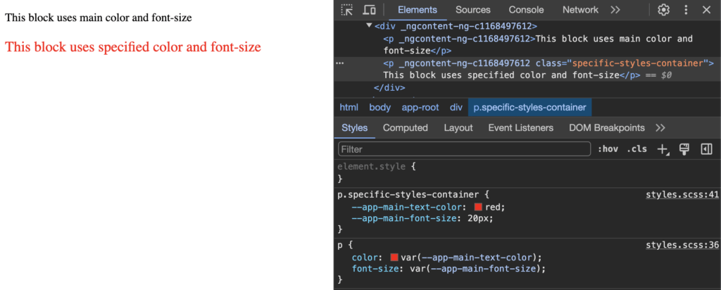
Now let’s imagine that we have the HTML below, and we need to use another text color or text size for a specific element. With CSS variables, it’s easy to implement.
example.html
<p>This block uses main color and font-size</p>
<p class="specific-styles-container">This block uses specified color and font-size</p>
example.css
:root {
--app-main-text-color: #000;
--app-main-font-size: 16px;
}
p {
color: var(--app-main-text-color);
font-size: var(--app-main-font-size);
}
p.specific-styles-container {
--app-main-text-color: red;
--app-main-font-size: 20px;
}Because the color and font-size values for the specific-styles-container class were changed, they show up differently from the default style for a P tag.
CSS vs SCSS Variables
Don’t worry if you use style preprocessors like SCSS, LESS, etc. They are all compatible with CSS variables. I will be using SCSS in the examples below.
SCSS offers its own variables, but CSS variables will help you in some cases. For example, they can help with facilitating style adjustments for child components without relying on deprecated methods like ::ng-deep and aiding in creating responsive layouts. Additionally, CSS variables play a crucial role in customizing Angular Material components, a feature introduced in Angular Material v15.
CSS variables remain invaluable in several scenarios, even when employing SCSS variables:
- Dynamic Styling for HTML Blocks: CSS variables prove indispensable when implementing dynamic styles for HTML elements. These styles may need to adapt based on user interactions, application state, or other dynamic factors.
- Calculated Data, like Width or Height: Utilizing CSS variables becomes essential when incorporating calculated data into stylesheets, such as dynamically adjusting width or height based on varying conditions or content.
- Dynamic Styles from External Sources, such as APIs: CSS variables provide a robust solution for incorporating dynamic styles sourced from external data, like APIs. For instance, color schemes for elements might depend on parameters fetched from an API response, enabling dynamic and customizable UIs.
- Avoiding ViewEncapsulation.None: In scenarios where it’s undesirable or impractical to use ViewEncapsulation.None for a component, CSS variables offer an alternative solution. They enable the encapsulation of styles within components while still allowing for dynamic adjustments and customization through variables.
By leveraging CSS variables alongside SCSS, developers can achieve greater flexibility and maintainability in their Angular applications, catering to diverse styling requirements and dynamic design needs.
Now that you know the basics of how to use CSS variables in general, let’s move on to the more interesting part where we will consider examples of using CSS variables in Angular applications.
Using CSS Variables in an Angular App
I propose to share an example where we will change styles for buttons using CSS variables. So let’s prepare some wrapper for the buttons.
styles.scss
:root {
  --app-font-family: Arial;
  --app-font-size: 14px;
  --app-text-color: #000;
  --border-color: #424242
}

* {
  box-sizing: border-box;
}

body {
  font-family: var(--app-font-family);
  font-size: var(--app-font-size);
  color: var(--app-text-color);
  margin: 0;
}

h3 {
  margin: 0;
}
app.component.ts
import { CommonModule } from '@angular/common';
import { Component, ViewEncapsulation } from '@angular/core';
import { RouterOutlet } from '@angular/router';
import { ButtonComponent } from './components/button/button.component';
import { IStyleProp, StylePropertyDirective } from './directives/style-property.directive';
@Component({
selector: 'app-root',
standalone: true,
imports: [
CommonModule,
RouterOutlet,
ButtonComponent,
StylePropertyDirective
],
templateUrl: './app.component.html',
styleUrl: './app.component.scss',
encapsulation: ViewEncapsulation.None
})
export class AppComponent {
exampleStyleConfig: IStyleProp[] = [
{name: '--app-button-border-width', value: '2px'},
{
name: '--app-button-hover-background-color',
value: 'var(--app-button-background-color)'
},
{
name: '--app-button-border-color',
value: 'var(--app-button-background-color)'
},
{name: '--app-button-background-color', value: '#0ccbcb'},
{name: '--app-text-color', value: '#682185'},
{name: '--app-button-hover-text-color', value: '#feff00'}
];
}app.component.html
<div class="container">
<div class="btn-container">
<h3>Default Button</h3>
<app-button text="Click Me"></app-button>
</div>
<div class="btn-container">
<h3>Example 1. Customized button styles via CSS variables.</h3>
<app-button class="customized-btn1" text="Click Me"></app-button>
</div>
<div class="btn-container">
<h3>Example 2. Customized button styles via CSS variables.</h3>
<app-button class="customized-btn2" text="Click Me"></app-button>
</div>
<div class="btn-container">
<h3>
Example 3. Customized button styles via CSS variables, inline styles.
</h3>
<app-button class="customized-btn3"
text="Click Me"
[ngStyle]="{
'--app-button-border-width': '3px',
'--app-button-border-style': 'dashed'
}">
</app-button>
</div>
<div class="btn-container">
<h3>
Example 4. Customized button styles via CSS variables and directive
</h3>
<app-button class="customized-btn3"
[appStyleProperty]="exampleStyleConfig"
text="Click Me">
</app-button>
</div>
</div>app.component.scss
.container {
padding: 30px 20px;
& > *:not(last-child) {
margin-bottom: 20px;
}
.btn-container {
border: 1px solid var(--border-color);
border-radius: 5px;
padding: 15px;
h3 {
margin-bottom: 10px;
}
}
.customized-btn1 {
--app-button-border-color: #0101b9;
--app-button-background-color: #3c3ce3;
--app-button-hover-background-color: #6e6ef5;
--app-text-color: #fff;
}
.customized-btn2 {
--app-button-border-width: 2px;
--app-button-border-color: #fa0000;
--app-button-hover-background-color: transparent;
--app-button-hover-border-color: #ef9393;
--app-text-color: #fa0000;
--app-button-hover-text-color: #ef9393;
--app-button-text-transform: uppercase;
}
}So far this is nothing special. I just prepared a wrapper with styles and added CSS variables defined globally in the :root element.
Now let’s create a button component in Angular:
button.component.ts
import { Component, EventEmitter, Input, Output } from '@angular/core';

@Component({
  selector: 'app-button',
  standalone: true,
  templateUrl: './button.component.html',
  styleUrl: './button.component.scss'
})
export class ButtonComponent {
  /** Text for the button. Required */
  @Input() text!: string;
  /** Make button disabled. Optional */
  @Input() disabled?: string;
  /** Emit click action */
  @Output() clickAction = new EventEmitter<MouseEvent>();
}
Example 1: Initialize variables inside the :host element.
button.component.scss
:host {
  --app-button-border-width: 1px;
  --app-button-border-style: solid;
  --app-button-border-color: var(--border-color); // --border-color already in initialized for :root element
  --app-button-border-radius: 5px;
  --app-button-background-color: transparent;
  --app-button-hover-background-color: #cecece;
  --app-button-hover-border-color: var(--app-button-border-color);
  --app-button-hover-text-color: var(--app-text-color);
  --app-button-padding: 5px 10px;
  --app-button-text-transform: capitalize;
  --app-button-height: 36px;
}
.app-button {
  border: var(--app-button-border-width) var(--app-button-border-style) var(--app-button-border-color);
  border-radius: var(--app-button-border-radius);
  background-color: var(--app-button-background-color);
  padding: var(--app-button-padding);
  text-transform: var(--app-button-text-transform);
  height: var(--app-button-height);
  color: var(--app-text-color);
  transition: all 0.25s;

  &:hover {
    background-color: var(--app-button-hover-background-color);
    border-color: var(--app-button-hover-border-color);
    color: var(--app-button-hover-text-color);
  }
}
Example 2: Use initial value of the property as a fallback. If the variable is not initialized, the default value will be applied. I like this approach, so will use this variant in my examples below.
button.component.scss
.app-button {
  --_app-button-border-color: var(--app-button-border-color, var(--border-color));
  border: var(--app-button-border-width, 1px) var(--app-button-border-style, solid) var(--_app-button-border-color);
  border-radius: var(--app-button-border-radius, 5px);
  background-color: var(--app-button-background-color, transparent);
  padding: var(--app-button-padding, 5px 10px);
  text-transform: var(--app-button-text-transform, capitalize);
  height: var(--app-button-height, 36px);
  color: var(--app-text-color);
  transition: all 0.25s;

  &:hover {
    --app-button-background-color: var(--app-button-hover-background-color, #cecece);
    border-color: var(--app-button-hover-border-color, var(--_app-button-border-color));
    color: var(--app-button-hover-text-color, var(--app-text-color));
  }
}
One other possibility is customizing the styles via a directive.
style-property.directive.ts
import { Directive, ElementRef, inject, Input, OnChanges, SimpleChanges } from '@angular/core';
export interface IStyleProp {
name: string;
value: string | number;
}
@Directive({
selector: '[appStyleProperty]',
standalone: true
})
export class StylePropertyDirective implements OnChanges {
@Input() appStyleProperty: IStyleProp | IStyleProp[] | null | undefined;
private _elRef: ElementRef = inject(ElementRef);
ngOnChanges(changes: SimpleChanges) {
if (changes.appStyleProperty) {
this._setProperty([].concat(this.appStyleProperty ?? []));
}
}
private _setProperty(props: Array<IStyleProp>): void {
if (
!Array.isArray(props)
|| !props.length
|| !this._elRef?.nativeElement?.style
) {
return;
}
props.forEach(({name, value}) => {
if (!name && !value) {
return;
}
this._elRef.nativeElement.style.setProperty(name, value);
});
}
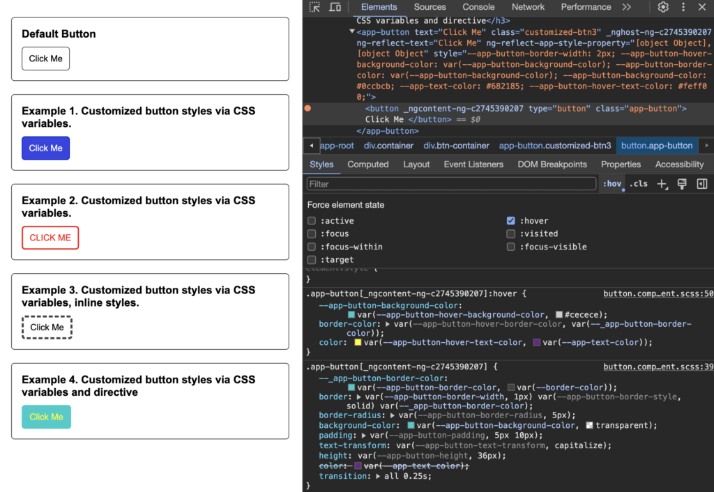
}As a result, we see four customized buttons and a default button, all styled with CSS variables, but using different customization methods:
- A default button that uses default styles.
- Example 1 and Example 2 use customization of styles using CSS classes
.customized-btn1,.customized-btn2. Seeapp.component.scss. - Example 3 uses customizing styles using HTML inline styles. See
app.component.html. - Example 4 uses customizing styles using the Angular attribute directive. See
style-property.directive.ts,app.component.html,app.component.ts
Conclusion
We’ve looked at different options for customizing styles using CSS variables, such as via a CSS class, an inline style, and an Angular directive. As you can see, none of these options are hard to use, and they can all help you make your Angular component styles more flexible and readable.
